I was talking about a dream I saw to a friend who was a character in that dream. But I forgot an important character of that dream. A few weeks ago, while watching a video about lucid dreaming, I learned that journaling your dreams after waking up helps remembering your dreams. So, I decided to journal my dreams and wanted to use a mobile app for that. I opened App Store and searched “dream journal”. A lot of apps appeared on the result but it was difficult to choose one as none are popular. So, I picked one based on the UI in the photos.
In the morning, I started journaling a dream I saw last night. After writing the dream when I tried to save it, it showed me an alert that I have not selected the dream type. I could not find where to select the dream type. But I discovered that I can add additional informations like characters, emotions and activities. I added the characters and selected emotions and activities from a lot of options. But when I tried to save it, it showed the same alert that I have to select the dream type. As I could not find it in the UI, out of frustration I tapped on the back button. It did not ask me whether I would like to store it as a draft. It even did not alert me that I will lose what have written so far. I lost everything I had written.
Then I tried to add a new journal again. Then I realised that there is a drop down list disguised as a label or help-text. Look at the screenshots below.
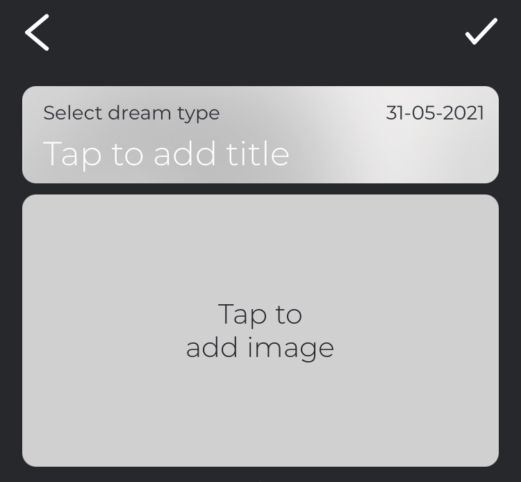
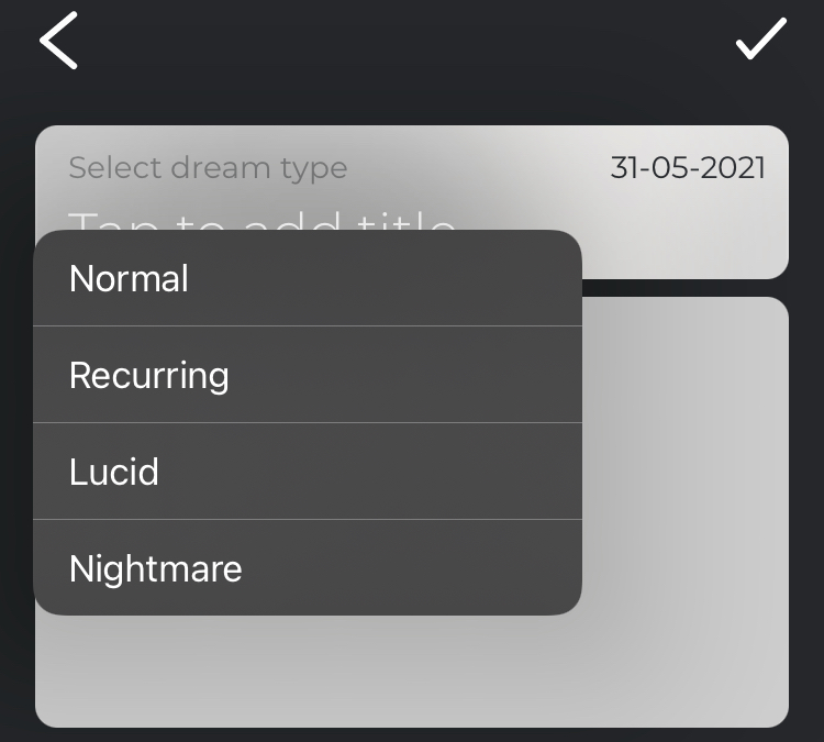
On that UI (image 1), “Select dream type” is a label for Dream Type drop down list. But I mistook it as a label/help-text for the title, which already have its label as the placeholder text. Now, when I tapped on the label “Select dream type”, it showed me the options for the drop down list (image 2).
I consider this a bad UI. So, what are the takeaways from here? Never design any element of the UI which can create confusion. A drop down list should look like a drop down list. It should not look like a text label. It should not look like a part of another element which is near it. And follow a good design system.
Some other takeaways are here which are not related to the UI but the UX. Alert the user that they may lose the data they have entered but not saved if the try to navigate away. Make it possible to save the unsaved data as draft. Autosave unsaved data as draft.
After losing the data I had entered, I did not have any patient to type those again. My goal was to remember the dream by journaling. And I felt that I achieved it by typing the dream. How I write it, where I write it are not much important. However, I will continue using the app to journal more dreams. I am also planning try other dream journal apps.
The name of the app is Dreamli. I may not use it longer as it’s a costly app. I can journal only 15 dreams for free. Then I need buy “dream cards” to journal more dreams. Also, in the options for dream type dropdown list, they don’t have all the options. If you need those dream types, you need to buy each dream type individually. I guess I am seeing someone selling dropdown options for the first time 😀
Leave a Reply