Since a long time I always complain about NIC (National Informatics Center). NIC develops and manages most of the websites and online applications for Govt. of India. The reason is pretty clear – lack of accessibility and web standard. And the reason behind such sucking website and applications is also pretty clear. As many of the Indian Govt. departments and offices, people at NIC are not perfectly eligible, don’t get the best training and don’t follow the best practices and web standards. Take out a random website, designed and developed by NIC. There is 99% chance that it must be using tables for everything. There is 50% chance that it’ll look ugly in all advanced and standard browsers other than IE 6. And 100% of those sites are ugly, if you know the current web design trend. This does not mean that Indians are not good at web design and development. There are many great Indian web designers and developers. This means no one at NIC knows good web design or web standard. In this post I am going to explain how OJEE (Orissa Joint Entrance Examination) e-Counseling Sucks.
Let me start with the term Carelessness. Being a perfectionist at my job, I hate people who are careless in their job. If you think to build any website, then you will think how will be the logo or the header. So I will about the header banner of the OJEE e-Counseling application. It’s written as “e – Counselling” on the banner. See the snapshot below.
However we can forgive this mistake. This type of spelling mistake is called as FCM (Frequently Committed Mistakes) and can be ignored while evaluating.
Before few days I came to know about that this time OJEE is introducing e-Counseling. I felt happy. I know that every year many people who come from far places from Bhubaneswar complain about the distance they travel for attending the OJEE counseling. So I was happy to see the development. As booking tickets online made my life easier, I dreamed that OJEE e-Counseling will help the counseling process much easier for thousands of students and their parents. One day one of our family friend came to me and told me to fill the college choices for his son. He had done the registration in some Internet Cafe before coming to me. He suddenly blamed the e-Counseling process. But I started advocating in the for of e-Counseling. Then I entered into the application and became a eye witness how OJEE e-Counseling sucks life of people related to it.
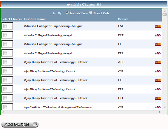
My task was to select choices as per the preference of colleges and branches. At my left hand side of the screen, there are 380 choices – different colleges and branches. However the list is sorted alphabetically, there was an option to filter all choices (colleges) by district. There was no option to filter choices by branch. Who would be using filter by district? You don’t choose institutes as per the district where they are located. Even few people don’t know which college is located in which district. I bet even few people don’t know how many districts are there in Orissa. And you will find few people who can tell the name of all 30 districts. So the sucking rule is “Give the feature which no one will use, but don’t give the feature which every one need”.
But there is one option to sort all choices by branch. The option is located in such a place that it is near by invisible. I entered to that page many times, but just noticed it while writing this post. If you notice it then it can help you a little bit. Sort by branch code is not really helpful. Take an example: if your branch is mechanical, then those choices will be far down in the list. If you use the add button next to any choice from those with mechanical branch, then the page submits and reloads with the other branch options at top. You need to scroll again and search for the college you want to add. However you can check all the colleges and then click on “Add Multiple” button. But the option to filter the choices by branch would have awesome.
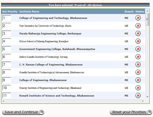
So I added all the choices to the left hand side of the screen after a long struggle. Now I have to sort it as per my preference of colleges. There are more than eighty choices which I needed to sort it by putting 1, 2, 3 so on. This was the toughest job, even tougher that coding a complex part of any web application. And if you missed a number while assigning a preference number to it, then while saving it, it will not allow you to save due to validation process. And to find where you made the mistake may make you cry. It happened to me and I quickly applied a formula to find out where I made the mistake, like I do to search for a bug. And it helped me and I able to find the missed number. I got lucky, otherwise God knows how much time I had to spend to find the little mistake.
On the second day, I wanted to bring the number 42 to number 1. One might guess that it’s an easy job and can be done by few clicks. But my friend it was never that easy. The validation process made it much difficult. Normally we have validation process to make life easier, for both the application and the user. But here the validation process sucks. It makes your life much harder. So to bring number 42 to 1, I had to remove all numbers from number 1 to 42. Then I have to assign number one to the old number 42. Then type other numbers (2 to 41) to other choices. This requirement was simple, so I did not cried. But imagine if you have to make many alteration to the sequence of choices, then you are dead.
If they could have added drag and drop to sort feature, then it must have much easier to sort all choices as per our preference. And adding such feature is very easy, using jQuery or any other popular Ajax framework. Who knows, people at NIC know jQuery and AJAX or not? WordPress does not have option to order the pages using drag and drop. Instead there is an option to put a number to order the page. You assign any number and it’ll allow you to sort accordingly and without any problem. I also remember, when I was working on my first PHP project, we have done something similar to sort all videos of anyone’s channel. We are allowing any number to place there.
I have talked much about few stuffs on a single page. There are many pages which I have not used. And if I will start writing about those, then it’ll end with writing a book. But let me tell you the most sucking part of this application. The session expires too quickly that when you are busy with selecting choices to add multiple choices or assigning a number to order them according to your preference, the session expires. And after all those hard work, when you submit the page, you will find all your hard work goes in vein. You have to do those hard work again, but you are unsure whether it’ll work that time or again the session will expire. As I am a web application developer and understand how the session works, so I opened another page of the website and kept it reloading in few intervals. Which kept my session alive, while I was working hard on another page. Guess if a normal person will face this issue, what will happen? I wonder how people at NIC tested this.
Now let me talk about how this e-counseling is bad for thousands of students and their parents? There is not much access to Internet in rural parts of India. How a normal person (aam admi – mango people) from a rural area will take this opportunity of e-counseling? I don’t know whether Govt. of Orissa or NIC made any arrangement for this. The person who asked me to do all these stuff told me that almost everyone is facing issue with this e-counseling. He also mentioned the OJEE officials also facing problem to use another part of this application. If this is how a NIC web application works, then I will undoubtedly say NIC Sucks.


Leave a Reply